Segment Analysis
Overview
The Segment Analysis dashboard provides an interactive way to debug and identify potential issues within specific data segments (also referred to as data cohorts).
The dashboard offers a comprehensive set of controls including metric presets that are tailored to support a diverse set of use cases. These include model performance debugging, bias and fairness investigation, and data quality analysis. It supports all metrics for both model and dataset resources.
Segments can each have their own performance metrics. Often when your performance metrics change, you would like to know which of your segments contributed most to the change. The Segment Analysis dashboard provides you this view through the "Performance debugging" preset.
The Segment Analysis dashboard allows you to compare up to two model metrics, a primary and a secondary, and see the breakdown by segment for those metrics.
Interface
There are two main components found on the Segment Analysis dashboard: 1) The timeseries chart which shows the selected metric values over the time range for the overall segment. On the left side of this chart you can see a single value for each metric aggregated over the time range. 2) The comparison bar charts, which show the metrics broken down by segment.
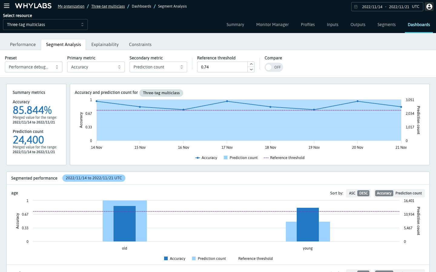
Classification models will default to Accuracy as the primary metric (dark blue), and Prediction count as the secondary (light blue). These defaults let you compare the volume of data points in each segment by looking at the secondary metric, which may affect the Accuracy of that segment as the primary metric. Regression models will default to Root Mean Square Error (RMSE) as the primary metric.
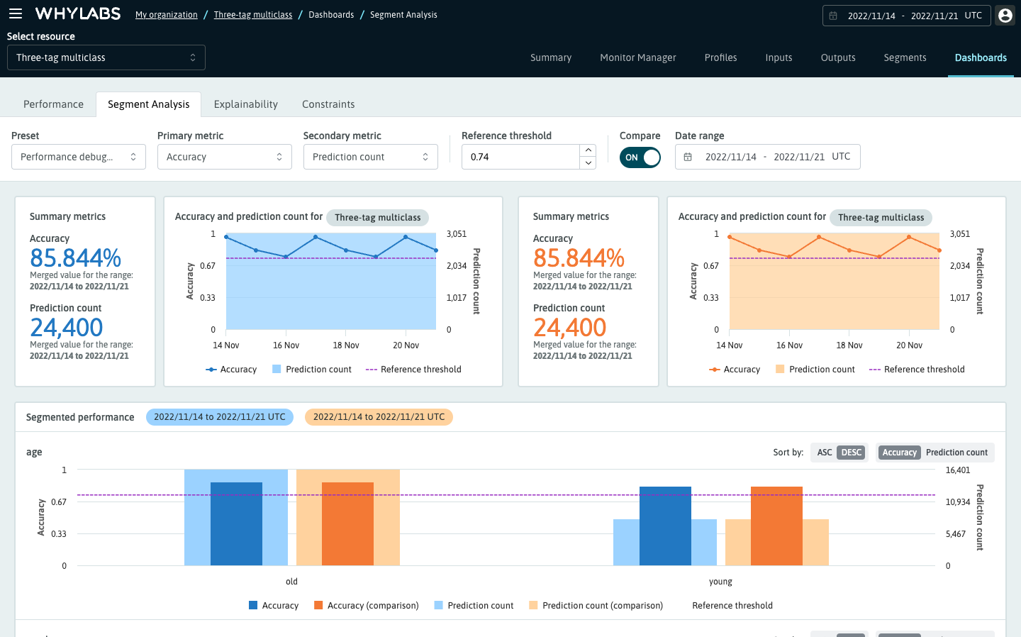
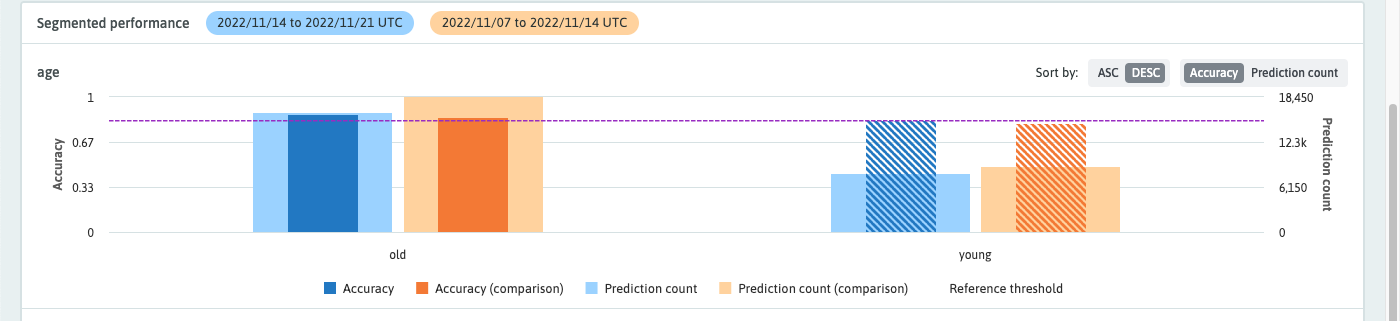
Comparing time ranges
To compare one time range to another or to compare a single profile to a time range, simply toggle the "Compare" switch and select a comparison time range. Comparisons are shown in orange; the primary metric will be dark orange, and the secondary metric light orange.
Reference threshold
The reference threshold is adjustable and is set automatically when you select a primary metric. By default, it will be set to the aggregated value for that metric over the time range or 80% of the max value for cumulative metrics. The reference threshold provides a midline for which segments appear below, and which appear above the primary metric for the whole time range.
The reference threshold highlights the segments whose primary metric falls on one side of the reference threshold depending on the selected metric. A few examples are as follows: Accuracy, Precision, Recall, and F1 score will highlight when the segment's metric is less than the reference threshold. Conversely, the False Positive Rate and Root Mean Square Error will highlight when the metric is greater than the threshold.
Uploading whylogs segmented performance data
# For classification models
segmented_classification_results = log_classification_metrics(
  df,
  target_column = "TARGET_COLUMN_NAME",
  prediction_column = "PREDICTION_COLUMN_NAME",
  schema = DatasetSchema(segments=segment_on_column("SEGMENTED_COLUMN_NAME"))
)
# upload results to whylabs
segmented_classification_results.writer("whylabs").write()
For regression models follow the same steps but use log_regression_metrics() in place of log_classification_metrics()
For more information, see the performance metrics documentation and segmentation documentation

