Custom Dashboards
Custom dashboards provide flexible options to view and compare metrics from the WhyLabs Observe and WhyLabs Secure portions of the AI Control Platform. Custom views across multiple resources and segments can be built that aren't possible elsewhere in the platform, and they provide the necessary visualization tools to enable debugging and root cause analysis.
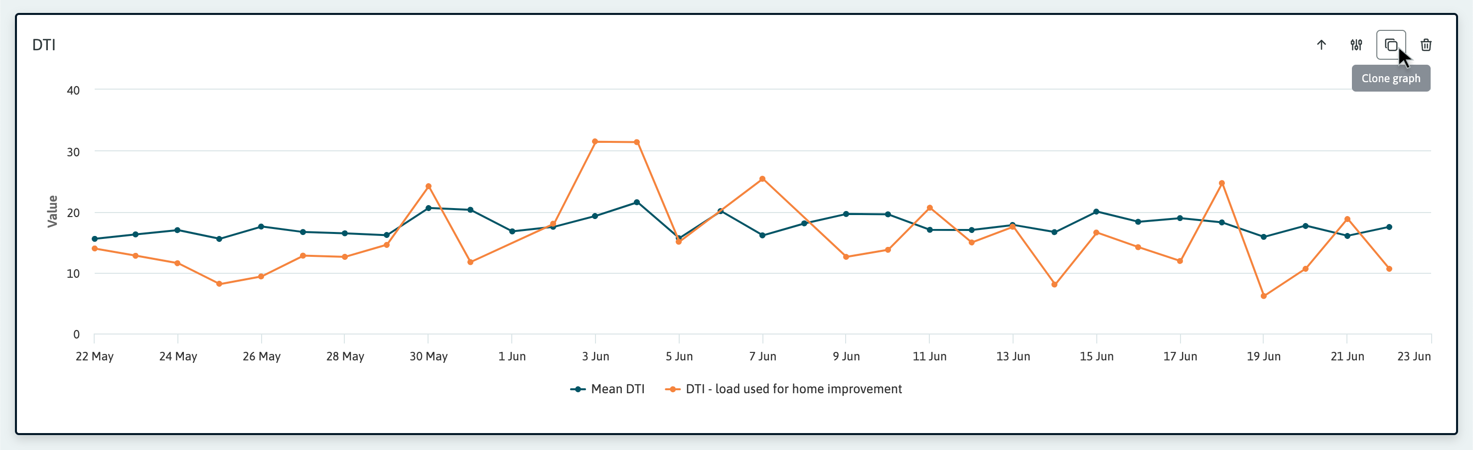
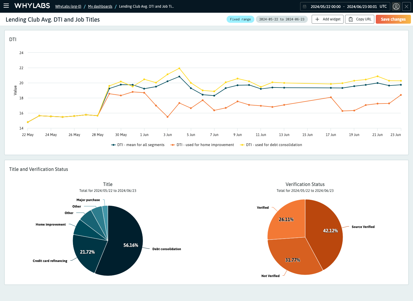 A custom dashboard example showing Debt-to-Income (DTI) metrics across different segments
Accessing Custom Dashboards
Navigate from the Project Dashboard by clicking on the "Dashboards" tab located on the right side of the WhyLabs header.
From there you will land on the "My Dashboards" tab, which lists all custom dashboards that have been created by users in the organization, and provides the ability to create new custom dashboards.
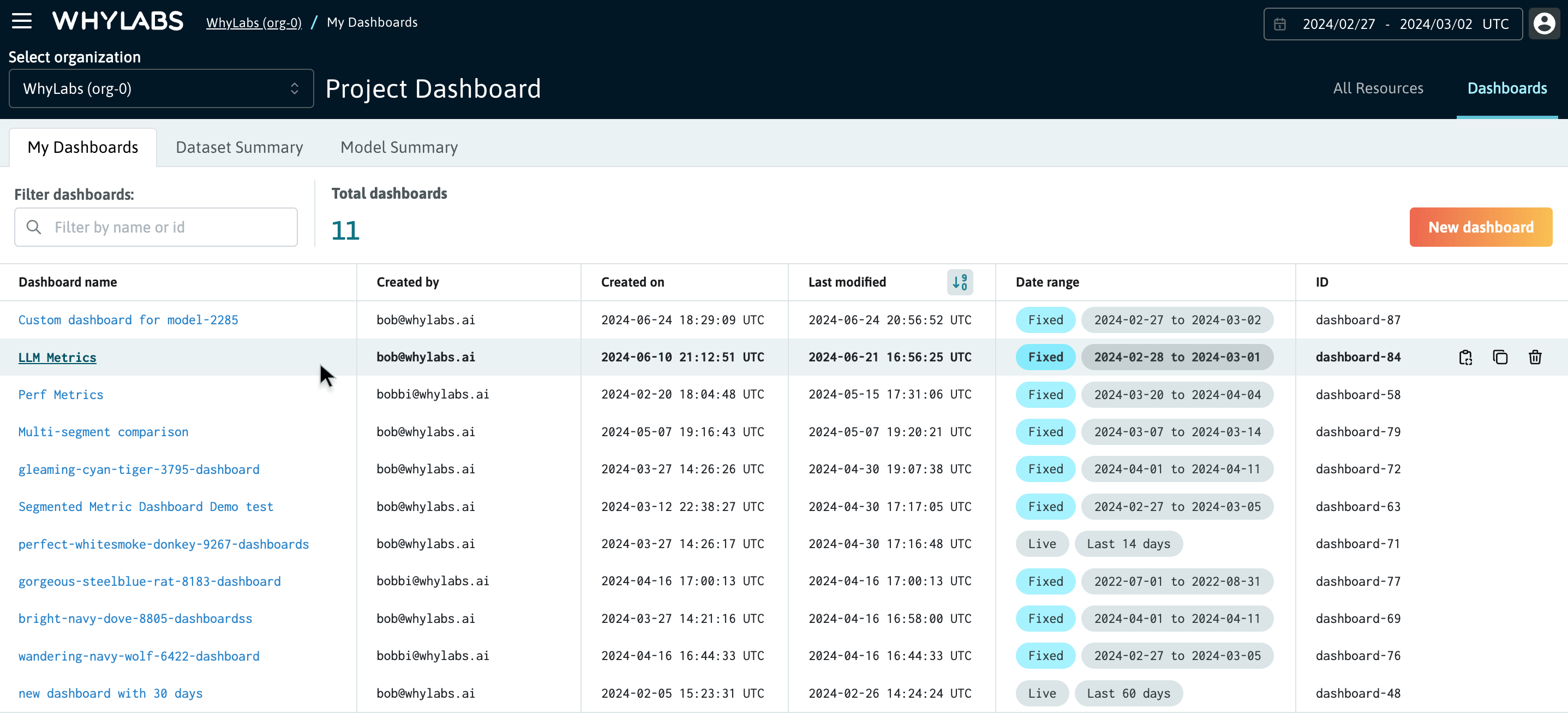 The "My dashboards" page showing a list of custom dashboards in an organization
💡 You can access your custom dashboards from anywhere in the platform from the side menu. Simply click on the hamburger menu in the top left corner of the WhyLabs header (next to the logo), and select "My dashboards" from the side menu.
Managing Custom Dashboards
After navigating to the custom dashboard list (in the "My Dashboards" tab) page you can:
- Sort the dashboards by name, created by, created on, or last modified columns
- Access dashboards by clicking on the dashboard name
- Create, edit, and delete any of the dashboards
The date range column lets you understand if dashboard's date range is either "Live" or "Fixed".
- "Live" means the dashboard range is always relative to the current date. This updates when viewing the dashboard.
- "Fixed" means the dashboard range is fixed to a custom date range date with defined start and end dates, which are also shown in the column.
💡 How you set the date range when creating or editing a dashboard determines if its range is live or fixed. Changing between relative and user-defined custom ranges will update the live or fixed range status.
Setting the correct date range
The default range for new dashboards is a live range—set to 7-days trailing window—and the dashboard's date range can be considered a global parameter for all graphs. When building graphs with multiple resources that have different date ranges, you will need to set the dashboard date range to be inclusive of the start and end dates for all resources.
From the graph builder, you can determine the profile lineage (data range) for each resource from the resource dropdown in the plot options. The profile lineage is provided to help you determine the time frame for which data is available for each resource.
Creating a new Custom Dashboard
The new dashboard flow is intuitive and easy to use. After clicking the "New dashboard" button you will be dropped into the dashboard builder flow. Add a name for the dashboard and select a widget to add to the new dashboard.
Supported dashboard widgets
Two types of widgets are supported for custom dashboards. These are:
- LLM evaluation widgets: designed to compare LLM metrics across different model versions or data cohorts
- Visualization widgets: designed to visualize metrics across different resources, metrics, and segments, as either time series or pie charts
A dashboard can be composed of any combination of these widgets, and you can add as many widgets as you need to the dashboard. Simple controls are provided for ordering widgets in addition to inserting new widgets in between existing widgets.
 The new dashboard flow showing the dashboard name and the widget library
💡 Remember: custom dashboards are scoped to the organization, so they are visible to all users in the organization
Working with visualization widgets
Two types of visualization widgets are available to cover a variety of use cases. These are:
- Time series graphs: used to visualize and compare metrics over time. Time series graphs are scoped to date range that is set for the dashboard.
- Pie charts: used to visualize only the top 5 Frequent Items for discrete features. Pie charts visualize the aggregate count of frequent items for the date range that is set for the dashboard.
Creating a new time series graph for your dashboard is as simple as selecting the resources, metrics, columns, and segments you want to visualize. There's no limit to the number of graphs that can be added to a dashboard.
Creating a new plot for the time series graph
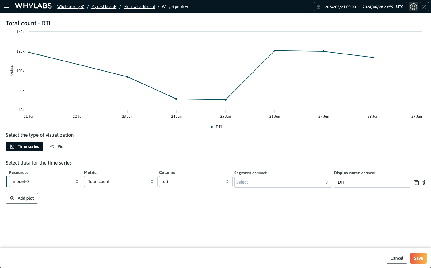 Controls for selecting the type of visualization and adding a new plot to the graph
Once you have selected a visualization widget, you will be redirected to the graph builder page. At this stage, you can still switch between time series and pie charts if you wish to do so. To get started on your graph, just click the "Add plot" button. If you select the pie chart option, the chart options will be scoped to only the metrics that are available for pie chart visualization.
The plot builder makes it easy to configure the plot parameters for the graph. The following selections are required for configuring the plot:
- Resource selection: choose the resource (model or dataset) you want to visualize. This dropdown groups resources by their batch frequency (hourly, daily, etc.), and includes secondary fields for profile lineage and batch frequency
- Metric selection: choose the metric you want to visualize. This dropdown is scoped to the metrics available for the selected resource, and grouped into categories such as dataset metrics, column metrics, custom metrics, etc. Refer to the "supported metrics types" section below for the full list of metrics
- Column selection: choose the column that you want to visualize. This dropdown is scoped to the columns available for the selected resource and metric. If the selected metric is a dataset-level metric, the column selection will be disabled
- Segment selection (optional): choose the segments you want to visualize. This control is a multi-select dropdown that lets you dynamically build segment definitions based on the segment key-value pairs that are available for the selected resource and column
- Segment wildcard is supported, which allows you to select all segments for a given key. Contact WhyLabs support for more information on how to enable this feature.
- Display name (optional): the display name is used in the legend and tooltip for the plot. The default plot name is a concatenation of the plot parameters and can become long and hard to read, in which case you can provide a custom display name.
After configuring the plot, you can "Save" button to persist the changes and back to the dashboard view, or add more plots to the graph. Additional plots start as a clone of the prior plot, so you can easily make small changes to the plot configuration, such as changing one parameter in the plot.
Secondary fields in the selection dropdowns
The plot selection dropdowns have secondary fields that provide additional context for the resource and metric. These are especially useful when you have multiple resources with different profile lineages, or metrics from different sources; the secondary fields provide the necessary context to make an informed selection.
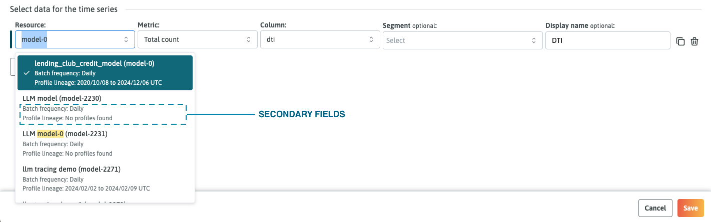 Diagram showing the location of the secondary fields for the resource selector
Supported metric types for time series graphs
- Column metrics: these are the statistical metrics that are calculated for each column in the dataset. These include metrics such as total count, null count, unique ratio, mean, median, min, max, quartile measures, and standard deviation
- Dataset metrics: these are the performance metrics for the model and will be scoped to the selected resource and be based on the model type (classification metrics, regression metrics, etc.)
- Custom metrics: these are similar to dataset metrics, but are user-defined metrics that have been added to the model
- Drift metrics: these are the computed drift measure that have been calculated by monitors that have been analyzing the model or dataset. These metrics will be scoped to the columns specified in the monitor's target matrix
- Anomaly counts: these are the counts of anomalies that have been detected by monitors that have been analyzing the model or dataset. Similar to drift metrics, these metrics will be scoped to the columns specified in the monitor's target matrix
- LLM Secure metrics: these are aggregate metrics for GenAI applications that are onboarded to LLM Secure, and include policy violation counts, latency metrics, token lengths, and more.
Creating LLM evaluation widgets
The comparison widgets are designed to meet the specific needs of LLM evaluation use cases, while offering flexibility for other potential applications. These widgets provide you the possibility to evaluate either multiple metrics across model versions or a single metric across multiple data cohorts.
By hovering your cursor below a widget, you will see a button that allows you to insert a new widget in that position. Just click the "Add widget" button to expand the side drawer and choose the comparison widget that best suits your requirements.
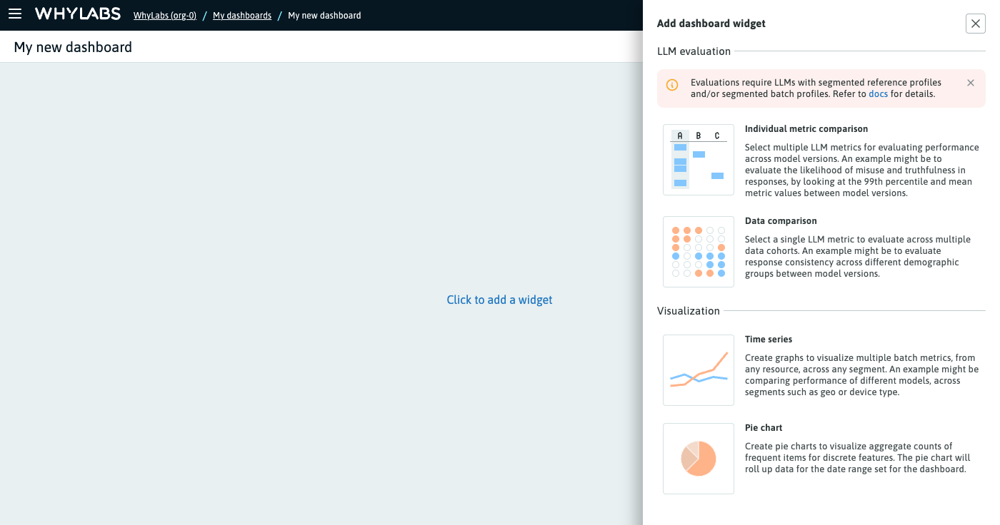
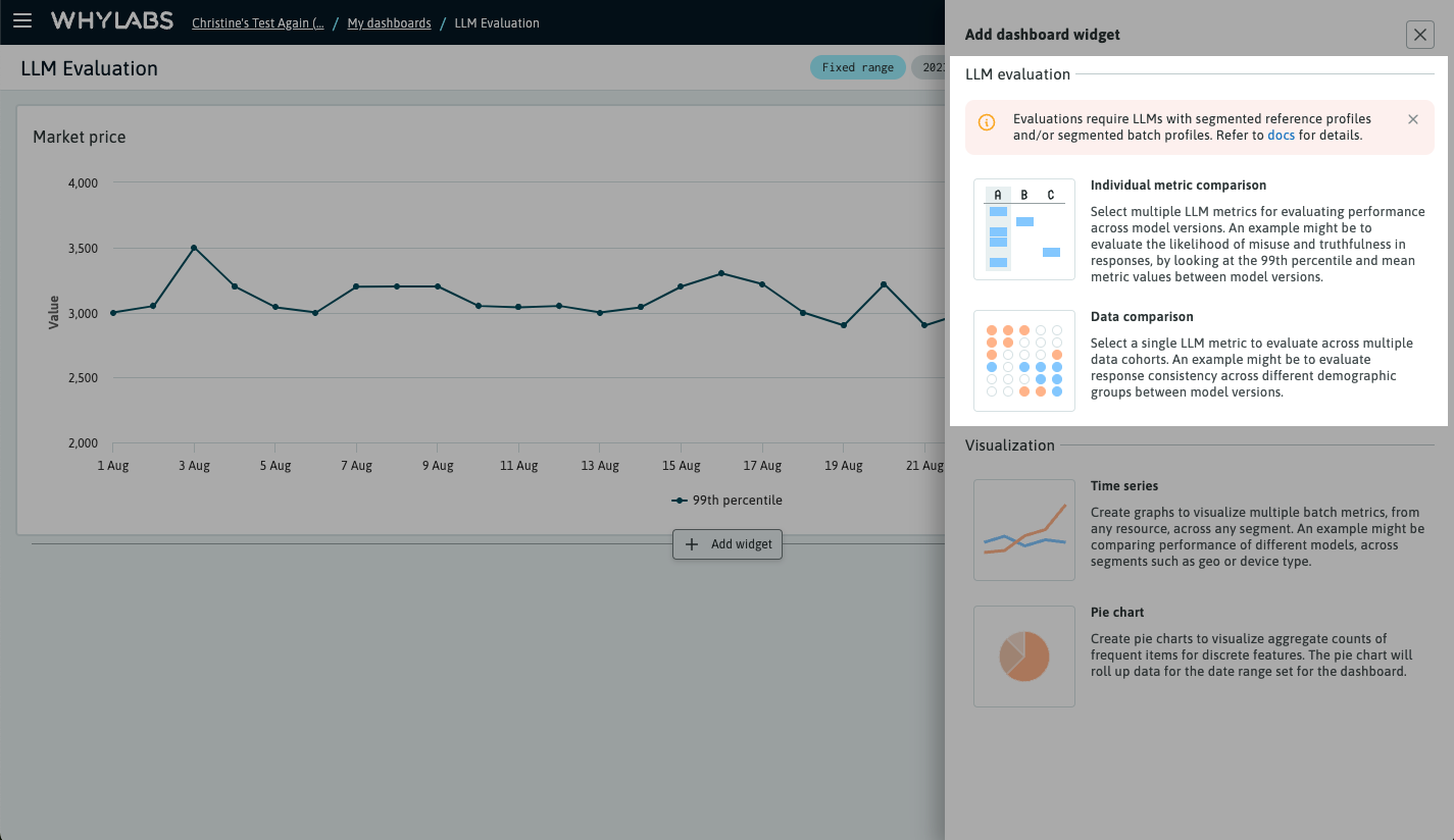 The widgets drawer with focus on LLM evaluation options
💡 Evaluations require LLMs with segmented reference profiles and/or segmented batch profiles. Refer to docs to learn how to segment your data and upload reference profiles with whylogs.
Individual metric comparison
When comparing individual metrics, it is possible to select multiple metrics and investigate which model performed better. The following example demonstrates how LLM ruleset scores can be compared across different LLM versions, which are represented as reference profiles.
After selecting the resource, select either date range or Reference profiles. For date range, use the date picker component displayed in the data controls panel to select a preset or custom date range for the evaluation. Choosing reference profiles will programmatically select up to 5 available reference profiles, which can be managed by clicking the "Manage selected reference profiles" button on the data controls panel.
Selecting metrics
Clicking the "Select metrics" button displays the metrics selector tool, which allows you to select "target column" metrics or dataset metrics. To select target column metrics, first select the resource columns, and then select the numeric metric values. This is done in two steps.
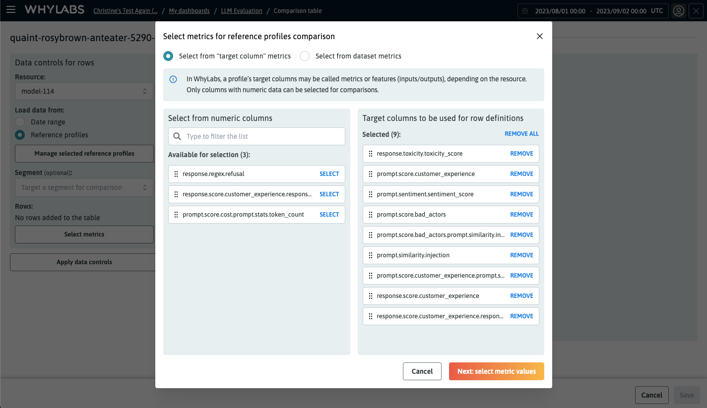 Selecting resource columns on the first step of metrics selection
After you choose the target column, click on "Next: select metric values" to choose the metric values. Each metric you choose will be applied to each target column you selected. Click on "Add rows" to apply the metrics selection and view the evaluation table.
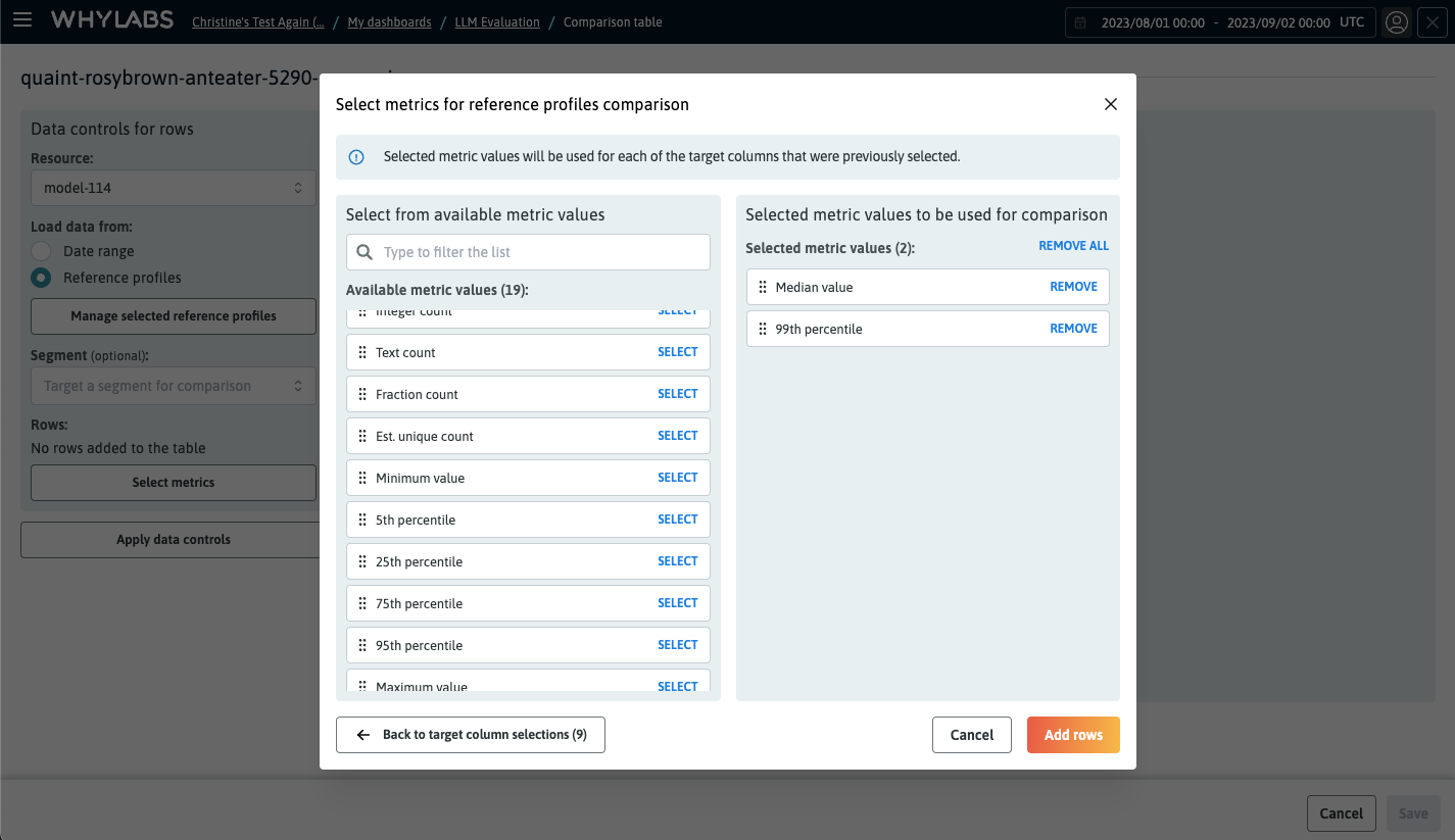 Selecting metric values on the second step of metrics selection
💡 You can repeat the metrics selection process if necessary. This allows you to have "target column" and dataset metrics in the same widget.
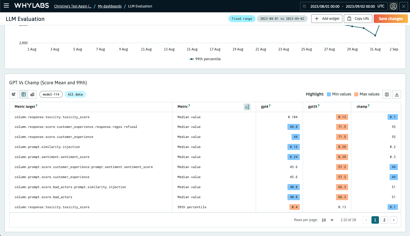
Once the metrics were selected, this is the table view populated with the selected metrics and reference profiles. You can change the widget name and save it to your dashboard now.
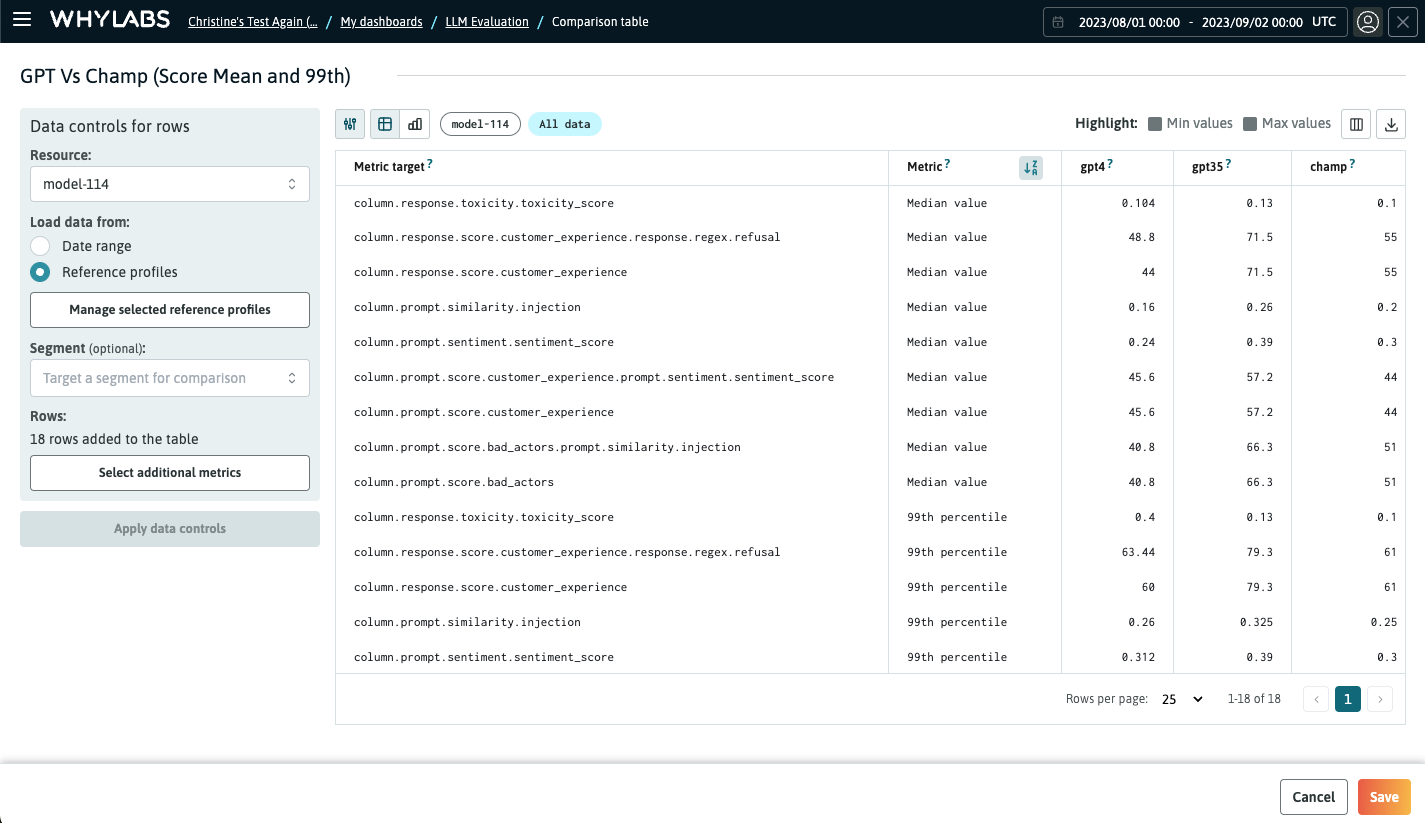
After you save the evaluation widget, you'll see it on your custom dashboard. You can also use the buttons in the top-right corner of the widget to highlight the minimum and maximum values for each row, helping you to understand the best reference profile.
💡 You can change the page size in the pagination controls to adjust the widget height.
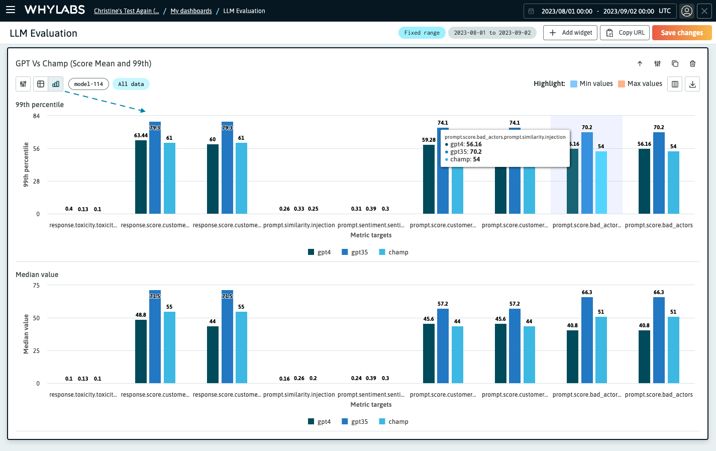
You can switch between table and graphs view using the buttons on the widget header controls. Each metric value is translated to a single chart, and the columns are grouped by metric target.
Data comparison
The data comparison widget lets you dig deep into a single metric and compare across multiple data cohorts. The setup is very similar to the previous widget. The following example shows how we can use this widget to compare the bad actor score for different apps across different model versions. Note that this example uses the date range comparison, so we need to have segmented batch profiles to create the table.
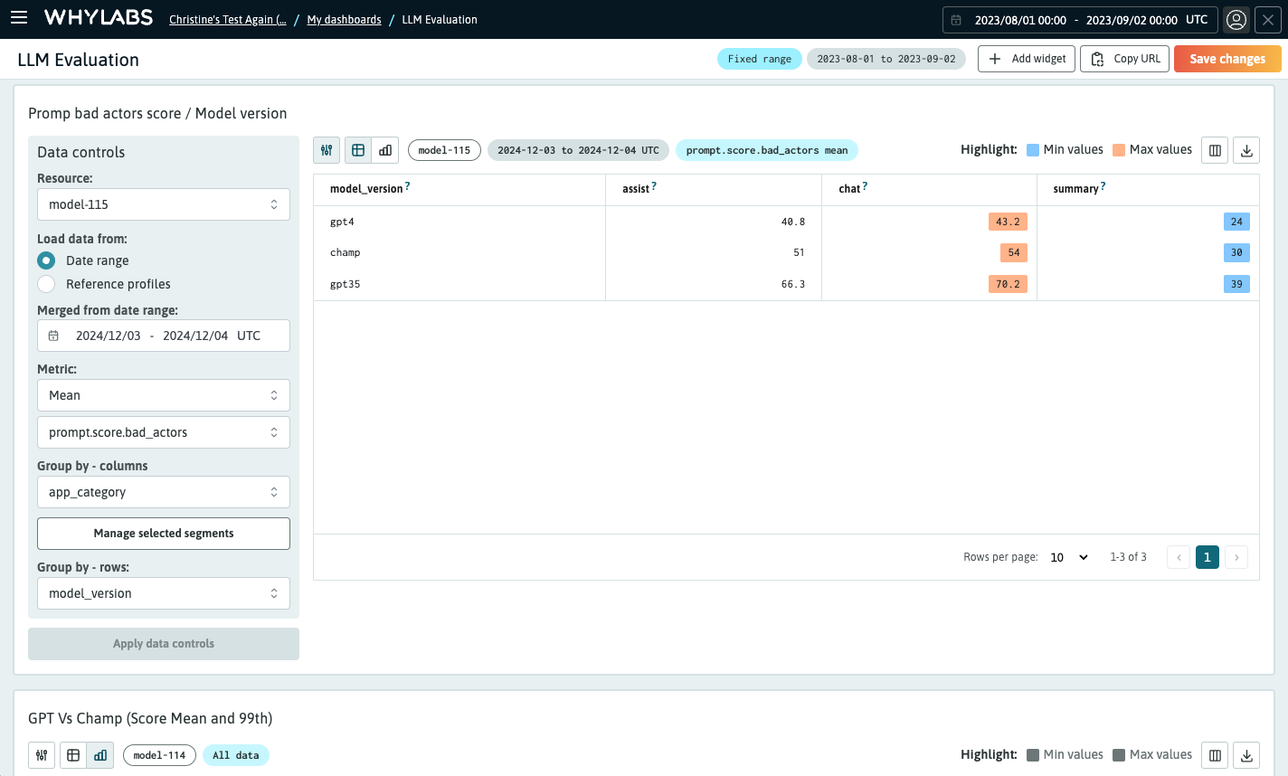
💡 You can click the first button on the widget header to display the data controls and quickly change the widget without having to go to the edit page.
Once you have the widgets set up, click the "Save changes" button at the top of the dashboard to apply the changes. Please note that the dashboard global date range control does not affect LLM comparison widgets. Use the download button on the widget header to export the table's data as a CSV file.
Editing a Custom Dashboard
After adding plots and saving the graph to the dashboard, you can repeat the process to add as many widgets as you need to the dashboard. From the dashboard view, you can modify the order of the graphs with the move button, in addition to being able to edit, clone, or delete a graph. Hovering over a graph will reveal the controls.
 Hover over a graph in the dashboard to access its control buttons

